Designing Forms is easy with Form Designer. You can still upload a Form Template spreadsheet (which is required for some of the more complex functions) but with Form Designer, you can create a form right in the user interface. See Using the Form Template for information about using the spreadsheet method of building forms.
ℹ️ Note: You can also upload a Form Template and then make changes in Form Designer. However, if you do this and try to download the form template again, you will lose some formatting inside the spreadsheet file (but it will still be fully functional).
Quick Start
1. Enter Form Designer:
- Click the Design button under your study card on the My Studies screen.
- To add a new Form, click +Add a Form. If you want to use an existing Form, go to the next step.
- Click the Form Card.
- Click the Design button to enter Form Designer.
2a. Add an Item to the Form:
- Click the + button.
- Enter the text of your question.
- Click +Add Question.
- Select the icon for the type of response you want for the question.
- Customize your question settings, skip logic, and validation criteria as needed. For multiple choice questions, replace Option 1, Option 2, etc. with your choices.
- Repeat as needed.
2b. Create a Group of Items:
- Click the item to select it. A blue outline appears to indicate that the item is selected.
- Click the Create group with selected questions button.
- Click the + button within the group to add a new item or drag and drop an item into the group.
- Repeat as needed.
ℹ️ Note: You can also hold the Ctrl button, select multiple items, and then click the Create group with selected questions button. If you start to drag something and then decide not to move it, click the Esc button.
3. Save Your Work
Click Save Draft to save your Form.
4. Preview Your Form
Click the Preview icon to preview your Form.
5. Exit Form Designer
Click the X to exit Form Designer.
6. Add the Form to Your Study
- Click the Menu icon next to your draft.
- Select Add to Study.
Form Designer Details
Layouts
A Layout determines the appearance of a Form, specifically, how items appear on the Form.
You Can Specify a Layout to Display:
- A single item per page or multiple items per page
- Each item in a separate line or items in a grid
To Select a Layout:
Click Layout & Settings.
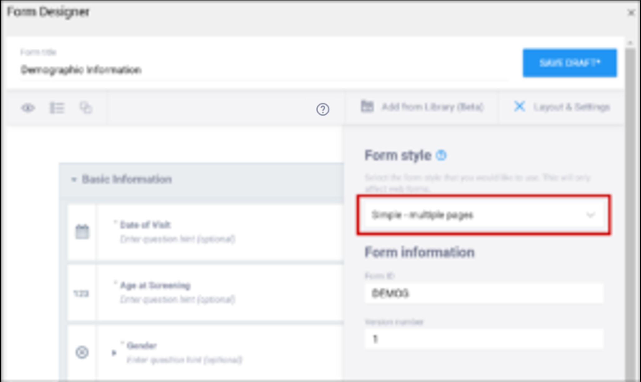
New Forms are set to Grid - multiple pages by default. Grids are ideal for adding multiple items in a single line.
Best Practices:
- In general, the Simple style is best for participant-facing Forms. The Grid style is useful for Forms with a lot of information and can deliver a better user experience for research professionals.
- If you are not sure how many pages you want the Form to have, consider using the multiple page layout, as you can specify the number of pages (including a single page) while the single page layout restricts you to one page.
Layout Options:
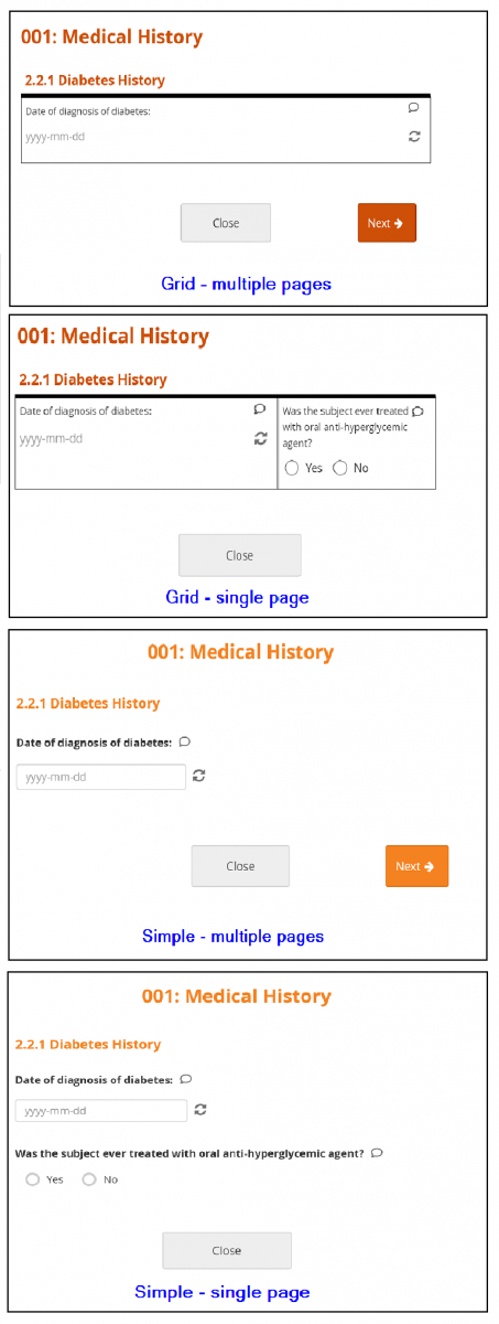
- Simple - single page: Items appear in rows on a single page. In the Form Definition spreadsheet, this is configured by leaving the Style column blank.
- Simple - multiple pages: Items appear in rows with each item on a separate page. In the Form Definition spreadsheet, this is configured by entering pages in the Style column.
- Grid - single page: Items appear in columns on a single page. In the Form Definition spreadsheet, this is configured by entering theme-grid in the Style column.
- Grid - multiple pages: Items appear in columns with each on a separate page (default). In the Form Definition spreadsheet, this is configured by entering pages theme-grid in the Style column.
Icons
The following icons appear on in the upper-left corner of the Form Designer screen:
| Icon | Action |
|---|---|
 | Preview Form |
 | Expand/Collapse Questions |
 | Create Group with Selected Questions |
 | Add Selected Questions to Library ℹ️ Note: If you are on the Launch plan, this option is not available. |
 | Delete Selected Items |
 | Duplicate Selected Questions |
The following icons appear on the right-hand side of each item:
| Icon | Action |
|---|---|
 | new Edit Question until here |
 | Delete Question ℹ️ Note: This action cannot be undone |
 | Duplicate Question |
 | Add Question to Library ℹ️ Note: If you are on the Launch plan, this option is not available. |
Layout Groups
Layout groups are a set of items that are grouped together on a Form. This feature is optional, and you can decide to include/exclude layout groups based on how you want the Form to look. These should not be confused with item groups, which are internal groups used in the database and data extracts.
To group items together, select each item on the top left item type icon, and then click the Group button. Once a group has been created, you can drag-and-drop items into that group.
To edit a layout group, click the Edit button (pen-and-paper icon) in the group header.
Within Group Settings, You Can:
- Make items in the group appear on the same page
- Specify the number of columns of items in the group
- Create a repeating group
- Define skip logic for the entire group
Content Library
Use the Content Library to add pre-made items to your forms. Instead of creating the same item each time you want to add it to a form, save the item or group of items in the Content Library to add it to the form instantly. For more information, refer to Using the Content Library.
Preview
Click the Preview button to preview your form.
Versions and Drafts
Click the Save Draft button in the upper right-hand corner to save your Form. This does not:
- Create a new version
- Include the draft when you publish your study
- Appear on the Activity Log
Your updated design appears on your Form card in Study Designer under Drafts. Your draft is labelled (latest), and if you have multiple drafts, it is moved to the top of the list.
To Create Multiple Drafts:
- Open the Form in Form Designer.
- Click Layout & Settings, and change the value in the Version number field.
- Click Save Draft.
- Repeat the process for each draft.
To Discard a Draft:
Click the Menu button next to the draft you want to delete, and selecting Discard.
ℹ️ Note: Discarded drafts are not retrievable.
To Save a New Version:
- Click Layout & Settings, and change the number in the Version number field.
- Click Save Draft.
- Exit Form Designer.
- Click the Menu icon next to the draft you want to make a version.
- Select Add to Study. Your Form becomes a version, and is no longer displayed in the Drafts section of the Form Card in Study Designer. This version is included when you publish your study.
To Overwrite an Existing Version:
- Do not change the version number.
- Click Save Draft.
- Exit Form Designer.
- Click the Menu icon next to the draft you want to make a version.
- Select Add to Study. Your pre-existing Form version is replaced by your new version, and is no longer displayed in the Drafts section of the Form Card in Study Designer. This version is included when you publish your study.
ℹ️ Note: If you want to make a new version of a Form (and not overwrite an existing Form), make sure to change the version number in the Layout & Settings panel.
Form Designer Limitations
Currently, Form Designer does not support all of the functionality that is available in OpenClinica Forms. Instead, use the Form Template to take advantage of these features. Specifically:
- You cannot use cross-form logic in Form Designer.
- You can add edit checks in Form Designer but hard edit checks must be defined in the Form Template.
- There is no functionality for cascading selects (i.e. you cannot restrict the list of options available in the next item based on the previous selection. You can still add conditional fields to determine whether the next item appears at all.)
Item Configuration Menu
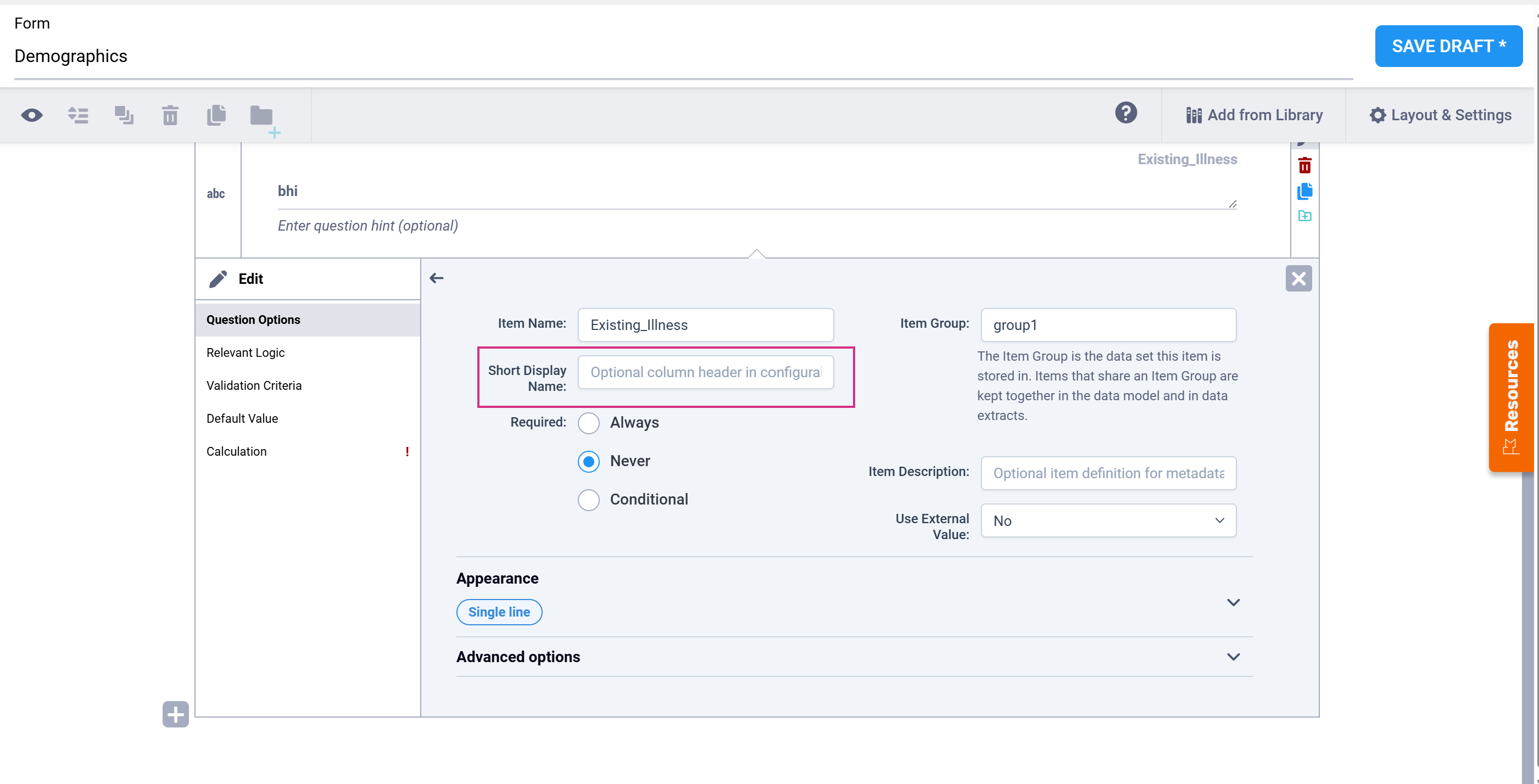
The configuration menu for an item in Form Designer is split into two sections. The main section includes the Item Name, Short Display Name, Required, Appearance, and Item Description fields. Below an ‘Advanced options’ toggle, a second section includes the Item Group and Read Only fields.
Depending on the item type and its settings, additional options - Skip Logic, Validation Criteria, Required Logic, Default Value, Calculation, and (for repeating Layout Groups) Repeat Count - appear as separate tabs in the item's left-hand navigation menu. See the field descriptions below for details on each.
Form Designer and Form Template Fields
Click the images to enlarge them.
| Field | Form Designer | Form Template |
|---|---|---|
| Form Title The form title appears at the top of the data entry page. | You can use alphanumeric characters, special characters (e.g. & # $ ^ _), and spaces | You can use alphanumeric characters, special characters (e.g. & # $ ^ _), and spaces. |
| Form ID A unique identifier used as an internal reference when the form is uploaded. This value is not visible to end-users. | Alphanumeric characters and underscores are permitted; no spaces. | Alphanumeric characters and underscores are permitted; no spaces.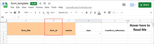 |
| Form Version A unique identifier for an iteration of a given form (including changes to items, form logic, etc.). | You must change the version number if you want to create a new version of your form. Otherwise, in the TEST environment, the new version overwrites the existing version except for changes to the item types, the item groups, or moving an item in or out of a repeating group. In the PRODUCTION environment, you can not overwrite a version of a form and must have a unique identifier for each version. Saving your form as a draft does not create a new version, but you can later promote a draft to a version using the Add to Study menu option on the form card in Study Designer. | In the Test environment you can overwrite versions for changes to anything except the following features (these require a new form or a new item name):
In the Production environment, you must have a unique version identifier each time you upload a modification to the form. |
| Form Style This specifies the layout and appearance of the form, primarily dealing with how the items are displayed (each question on a separate line, or a grid, and whether on a single page or multiple pages by groups). | There are four styles to choose from:
ℹ️ Note: If you group items together and click the "Show all questions in this group on the same screen" check box, items in the group appear on the same page, overriding a multiple pages setting. | You can leave this column blank or select from three options: If left blank: Each question is on a separate line on the same page. [Simple - single page]
ℹ️ Note:
|
| Question Text/Label | This is the text that appears in the Form for an item/question.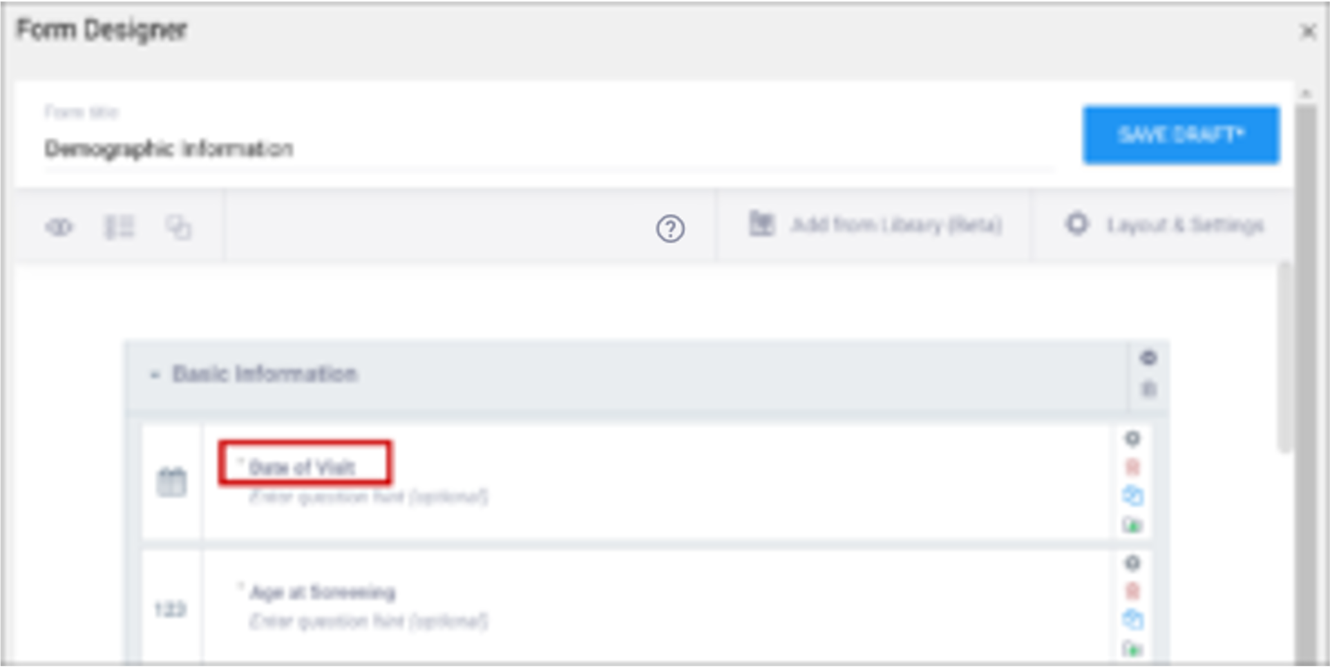 | Enter the question text in the
|
| Enter Question Hint/Hint | Informative text that appears on the Form to help the user. For example, “Please provide weight in kilograms.” Hints appear in italics under the question label. | Informative text displayed on the form to help the user. For example, Please provide weight in kilograms. Hints display in italics under the question label. |
| Item Name/Name | The internal name of the item, as used in the database. This is used to generate the item object identifier (OID)This does not appear during data entry. Alphanumeric characters and underscores are allowed.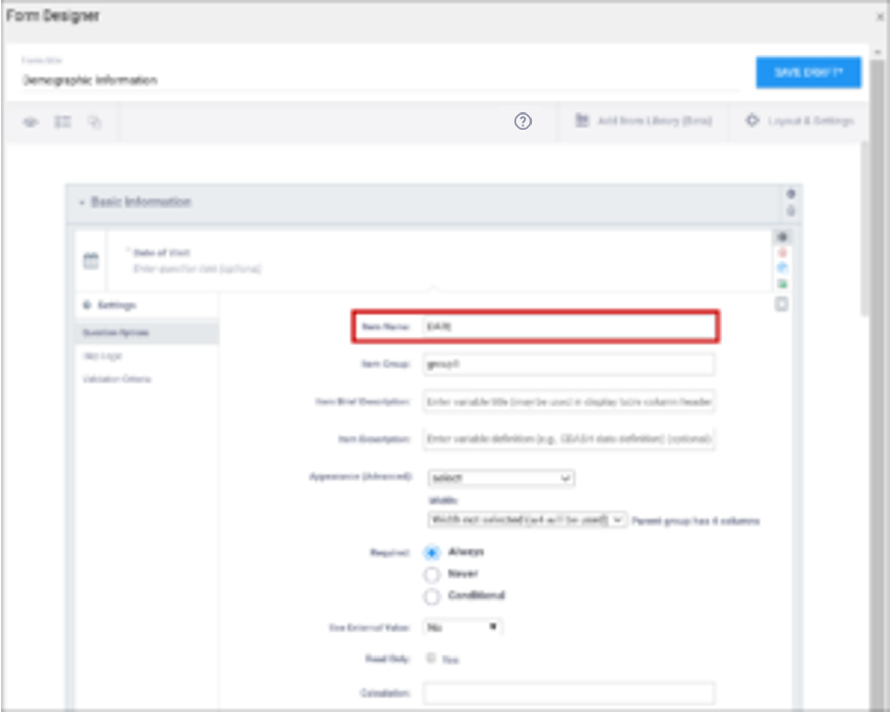 | The unique name of the item. This is not displayed during data entry, but is how the data is referenced in the database. Allows alphanumeric characters and underscores; spaces are not allowed. It is recommended that only lowercase letters, digits, and underscores are used in item names. Once an item name is defined in this spreadsheet and the form is uploaded into OpenClinica, the name should not be changed to use different letter case when the form is uploaded again. For example, if item1 is part of the first form upload, this name should not be changed to ITEM1 or Item1 when the form is subsequently uploaded. Any change from/to upper/lower case in an item name will result in a form or publish error. |
| Item Group | The internal name of the group that the item is in, as used in the database. This is used to generate the item object identifier (OID). Alphanumeric characters and underscores are allowed; spaces are not allowed.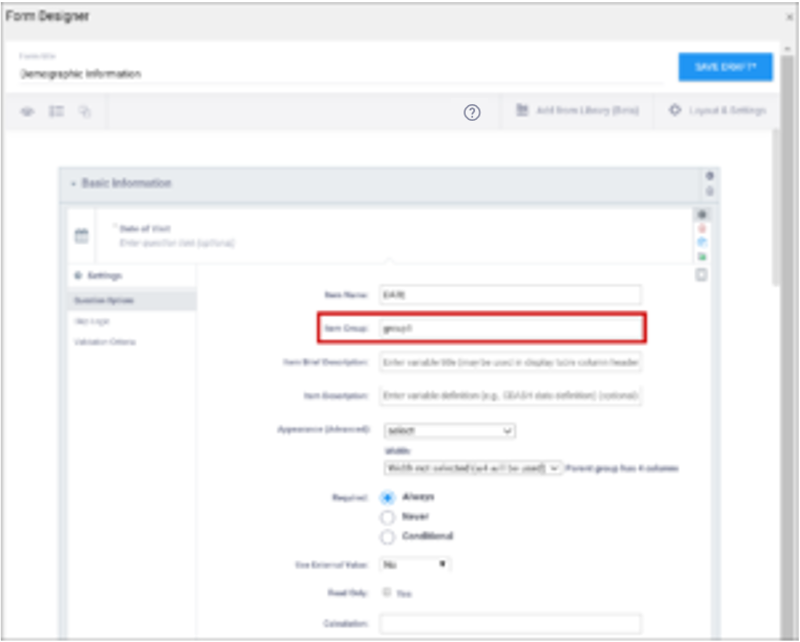 | The name of the group to which you are assigning the item in the underlying database. This becomes the item group object identifier (OID). Alphanumeric characters and underscores are allowed; spaces are not allowed. It is recommended that only lowercase letters, digits, and underscores are used in itemgroup names. The itemgroup name does not have to correspond to the begin/end group names defined in the type column. Begin group/repeat, end group/repeat, and note types should not have a value in the bind::oc:itemgroup cell. All items in a repeating group must have the same itemgroup name. That itemgroup name cannot be used by other items that are outside that repeating group. Once an itemgroup name is defined in this spreadsheet and the form is uploaded into OpenClinica, the itemgroup name should not be changed to use different letter case when the form is uploaded again. For example, if group1 is part of the first form upload, this should not be changed to GROUP1 or Group1 when the form is subsequently uploaded. Any change from/to upper/lower case in an itemgroup name will result in a form or publish error. |
| Type | The data type of the item (e.g. select one, select multiple, etc.)
| The data type of the item (e.g. select one, select multiple, etc.)
|
| Short Display Name | A short description of the item that can be used to reference it in tables. This description can be up to 40 characters. You cannot use special characters. If this is not defined for an item in a table, the Item Name appears instead.
| A short description of the item that can be used to reference it in tables. This description can be up to 40 characters. You cannot use special characters. If this is not defined for an item in a table, the Item Name appears instead. |
| Item Description | A long description of the item that can be used to define the data that the item/question contains. This is not displayed on the Form during data data entry. The text can be up to 3,999 characters. You cannot use special characters. The description is included in some data extract formats.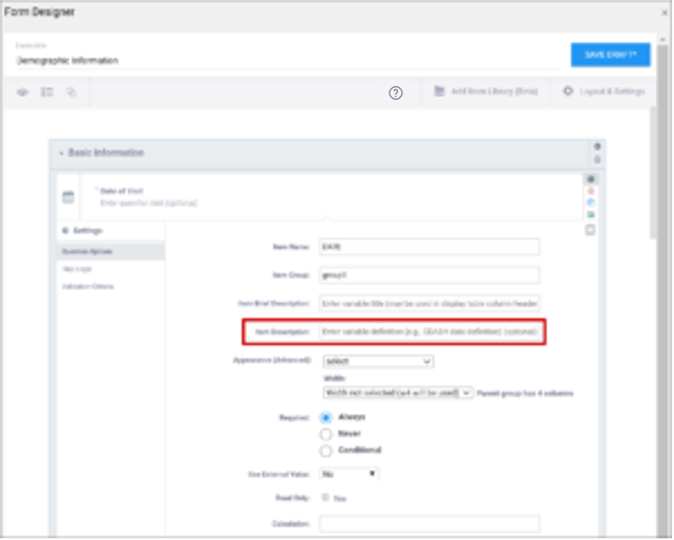 | A long description of the item that can be used to define the data that the item/question contains. This is not displayed on the Form during data data entry. The text can be up to 3,999 characters. You cannot use special characters. The description is included in some data extract formats. |
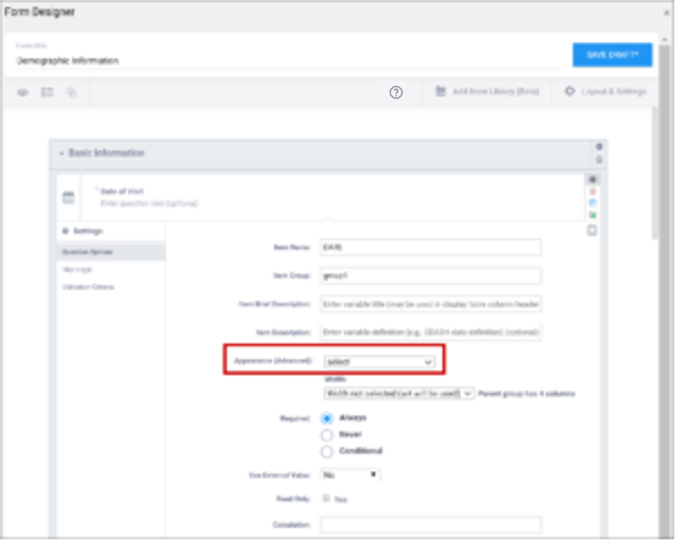
| Appearance | This determines how each item appears based on its Type. Items do not have a specific appearance by default. This setting is optional. ℹ️ Note: the type,other indicates that instead of selecting the option, other, you can enter the appearance directly in the field. other also appears as an option for the item types indicated. You can specify width for any item. (See Width) Single select / Multi-select
text
integer
decimal
calculate
Date
note
file
image
audio
video
Layout groups
ℹ️ Note: Items with no label or hint are treated as background calculations.
| This determines how each item appears based on its Type. Items do not have a specific appearance by default. This setting is optional. ℹ️ Note: the type,other indicates that instead of selecting the option, other, you can enter the appearance directly in the field. other also appears as an option for the item types indicated. You can specify width for any item. (See Width) Single select / Multi-select
text
integer
decimal
calculate
Date
note
file
image
audio
video
Layout groups
ℹ️ Note: Items with no label or hint are treated as background calculations. |
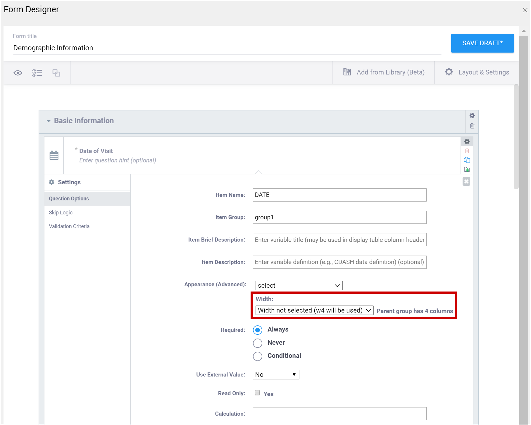
| Width | For an item or group of items on a grid form, you can control how many columns appear on each row by specifying the width w#. If you specified a width of w6 for a layout group, it takes up the entire width of the grid. If you specified w1 for a single item in the group, there would be one small column (1) and another large column (5). | For an item or group of items on a grid form, you can control how many columns appear on each row by specifying the width w#. If you specified a width of w6 for a layout group, it takes up the entire width of the grid. If you specified w1 for a single item in the group, there would be one small column (1) and another large column (5). |
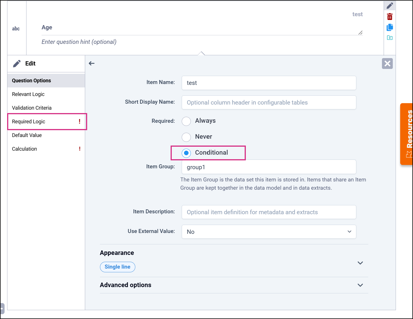
| Required | This specifies whether a user is required to enter a response to the item to proceed with data entry. Select Always, Never, or Conditional to specify whether/when a response to this item/question is required. If you select Conditional, a Required Logic option appears in the left navigation menu. Select Required Logic to enter the expression that determines when the item is required Use the Required Logic panel to define the expression used when the item's Required setting is Conditional. The item is treated as required when the expression evaluates to true. | This specifies whether a user is required to enter a response to the item to proceed with data entry. For required fields, type yes in the required column on the survey sheet. For conditionally required fields, enter a condition, as defined in the relevant column of the survey sheet. For example, if Number of packs per day is required if Does the subject smoke? is answered yes, enter: ${smoke} = 1 ℹ️ Note: This column supports the syntax as defined in the calculation, constraint, or relevant columns of this worksheet. Refer to those column comments for additional examples. |
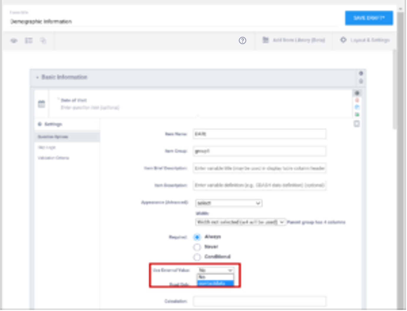
| Use External Value | This item is a value used for logic or calculations. clinicaldata is used for cross-Form, cross-event, or event level calculations. contactdata displays contact data on a form. If you enter contactdata, you must add a column called instance::oc:contactdata. That column must contain one of the following values to indicate which contact information it is collecting: firstname, lastname, email, mobilenumber, secondaryid. | This item is a value used for logic or calculations. clinicaldata is used for cross-Form, cross-event, or event level calculations. contactdata displays contact data on a form. If you enter contactdata, you must add a column called instance::oc:contactdata. That column must contain one of the following values to indicate which contact information it is collecting: firstname, lastname, email, mobilenumber, secondaryid. |
| Default Value | Specifies a value or expression that automatically populates the item when the form is first opened. Select Default Value from the left navigation menu to enter the value or expression.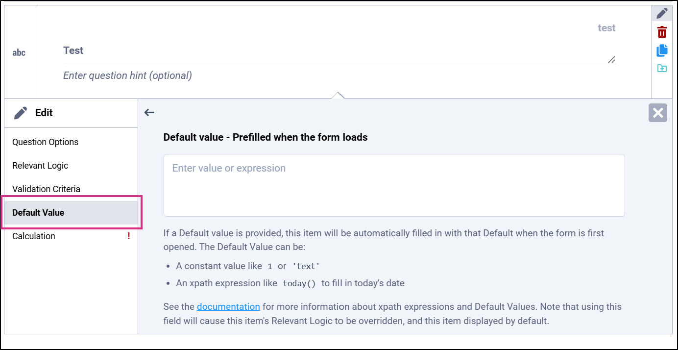 | Enter a constant value or expression in the default column of the survey worksheet. This value or expression automatically populates the item when the form is first opened. |
| Read Only | This specifies that you cannot enter data for an item. This can be used for the types of text, calculations, etc.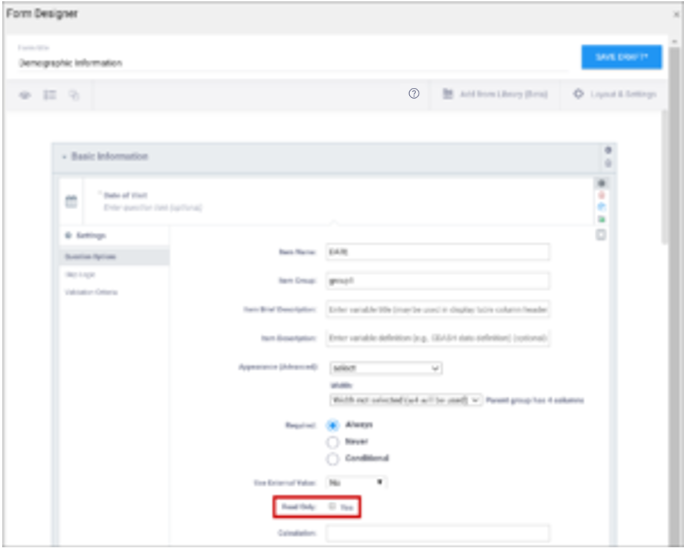 | This specifies that you cannot enter data for an item. This can be used for the types of text, calculations, etc. |
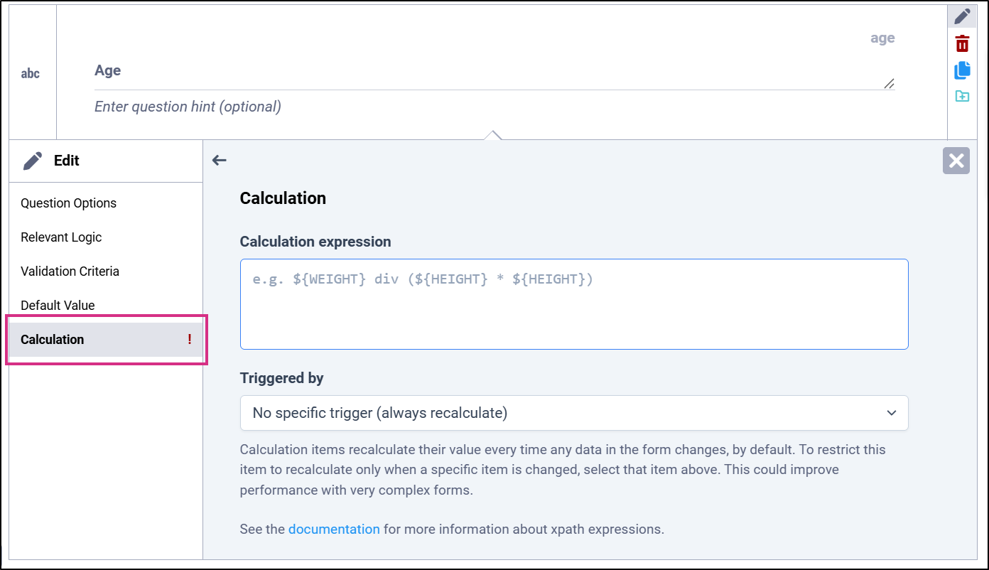
| Calculation | Select Calculation from the left navigation menu to enter an expression used to calculate a value, usually using the values of preceding questions on the current Form. This can also be used for Cross-form calculations. . is used to represent the current field's value. ${name} is used to reference a different item value on this Form, where name is the name of the other item. You can use parentheses. Optionally, specify an item that triggers recalculation. If no item is specified, the calculation is recalculated whenever data on the form changes. The following operators can be used:
or For example, to calculate Mean Arterial blood Pressure (MAP) based on the items systolic and diastolic: (systolic + (2*diastolic)) div 3 Calculations cannot be used for items with type of note. If calculation is used for any type except calculate, that field must have Read Only set to yes.
| An expression used to calculate a value, usually using the values of preceding questions on the current Form. This can also be used for Cross-form calculations. . is used to represent the current field's value. ${name} is used to reference a different item value on this Form, where name is the name of the other item. You can use parentheses. The following operators can be used:
or For example, to calculate Mean Arterial blood Pressure (MAP) based on the items systolic and diastolic: (systolic + (2*diastolic)) div 3 Calculations cannot be used for items with type of note. If calculation is used for any type except calculate, that field must have Read Only set to yes. |
| Response Text/Label | The question text to be displayed on the data entry form. This field allows alphanumeric characters. Add a line break where you want using Ctrl-Enter or Ctrl-Alt-Enter (Windows) Option+Enter (Mac). Styling prompts can be added to format your text as follows: *text* displays as italics **text** displays as bold ***text*** displays as bold italics Increase font size by preceding the text with one to six hash tags. # makes the text the largest possible size, ## makes the text the smallest possible size. Sizes that display may vary for note vs. item vs. group labels. Colors can be added as follows: text for red text. You can use the hex code for the color of your choice. (You can look up hex codes by searching for css codes on the internet.) | The question text to be displayed on the data entry form. This field allows alphanumeric characters. Add a line break where you want using Ctrl-Enter or Ctrl-Alt-Enter (Windows) Option+Enter (Mac). Styling prompts can be added to format your text as follows: *text* displays as italics **text** displays as bold ***text*** displays as bold italics Increase font size by preceding the text with one to six hash tags. # makes the text the largest possible size, ## makes the text the smallest possible size. Sizes that display may vary for note vs. item vs. group labels. Colors can be added as follows: text for red text. You can use the hex code for the color of your choice. (You can look up hex codes by searching for css codes on the internet.) |
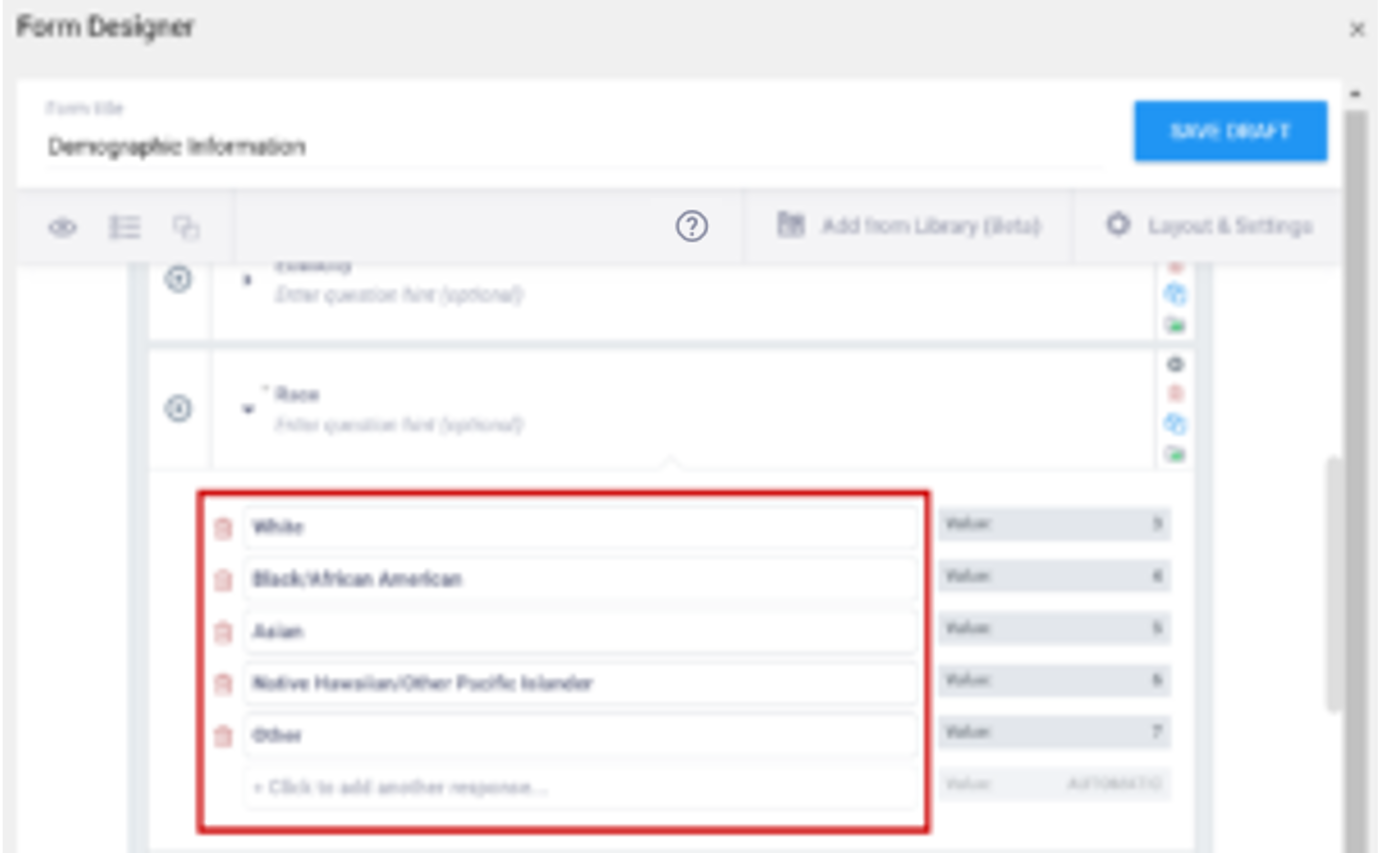
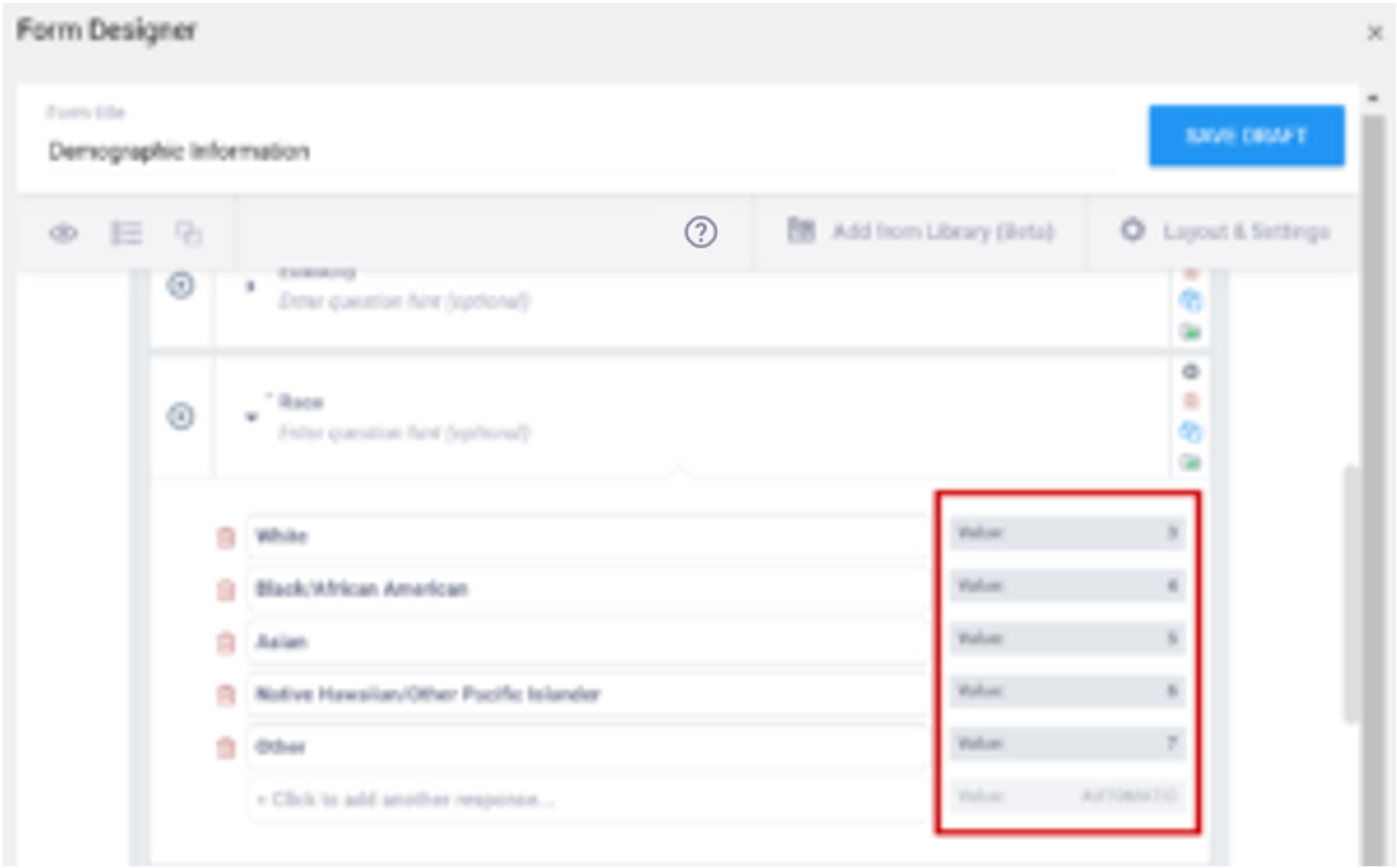
| Value/Name | The unique code value stored in the database that corresponds to each answer choice (e.g. 1=Yes). These codes are generated automatically but can be changed. | The unique code value stored in the database that corresponds to each answer choice (e.g. 1=Yes).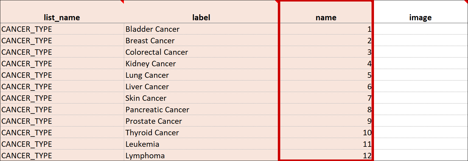 |
| Item Name/Name | The unique internal name of the layout group used in the database. This is not displayed during data entry. Alphanumeric characters and underscores are allowed.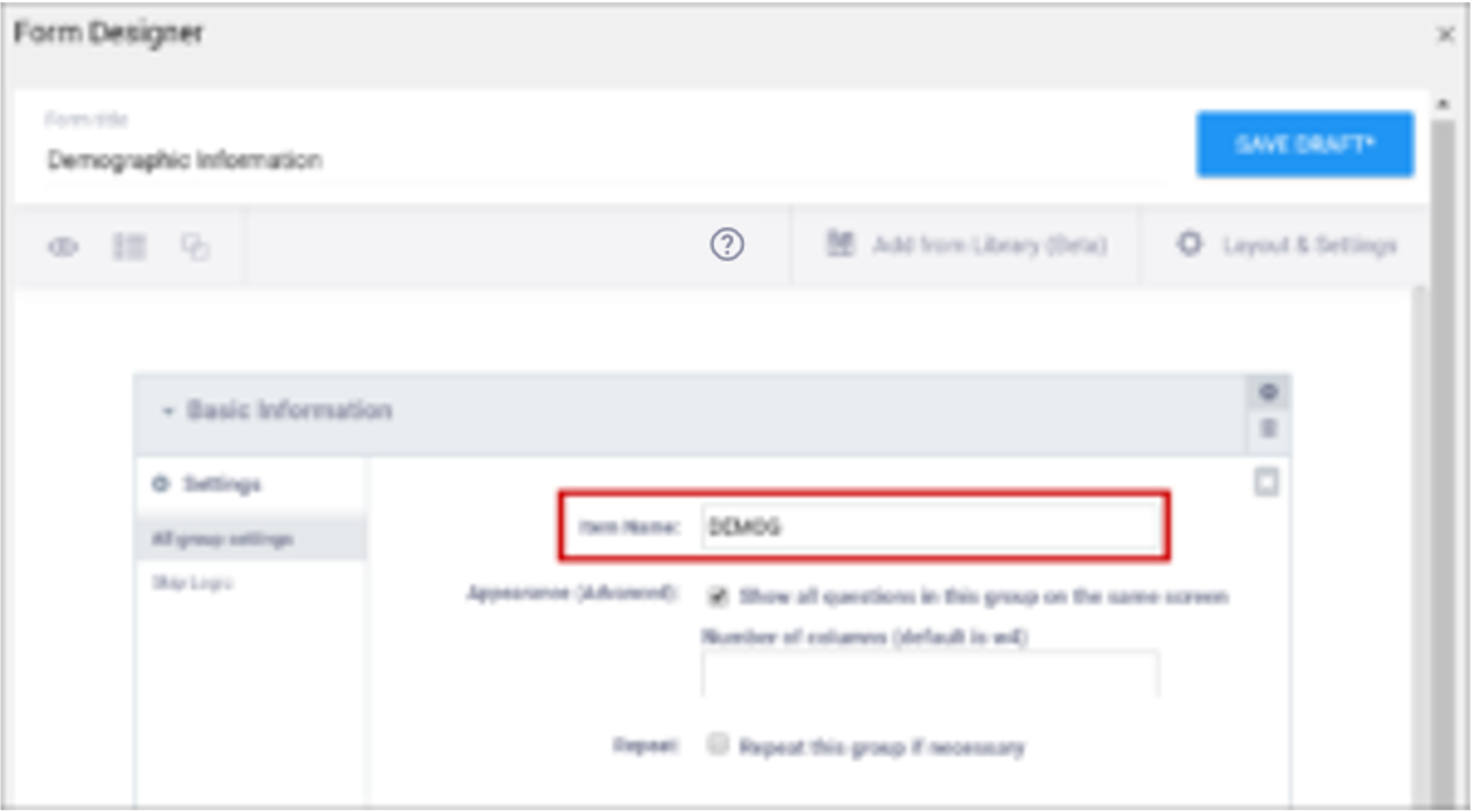 | The unique internal name of the layout group used in the database. This is not displayed during data entry. Alphanumeric characters and underscores are allowed.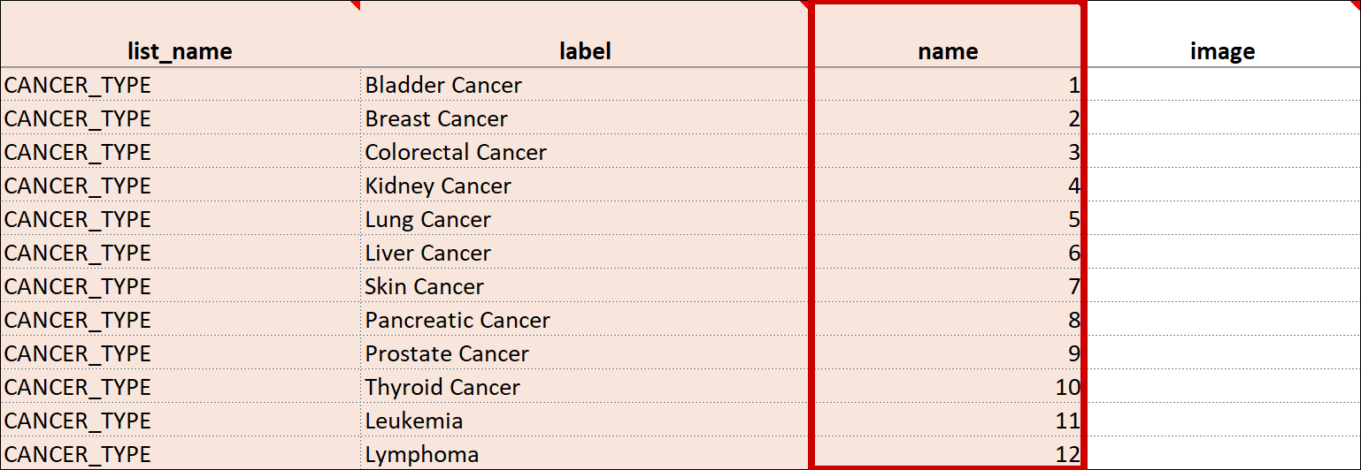 |
| Show All Questions in this Group on the Same Screen/Appearance | Click this check box to make all items appear on the same screen (regardless of your layout selection.)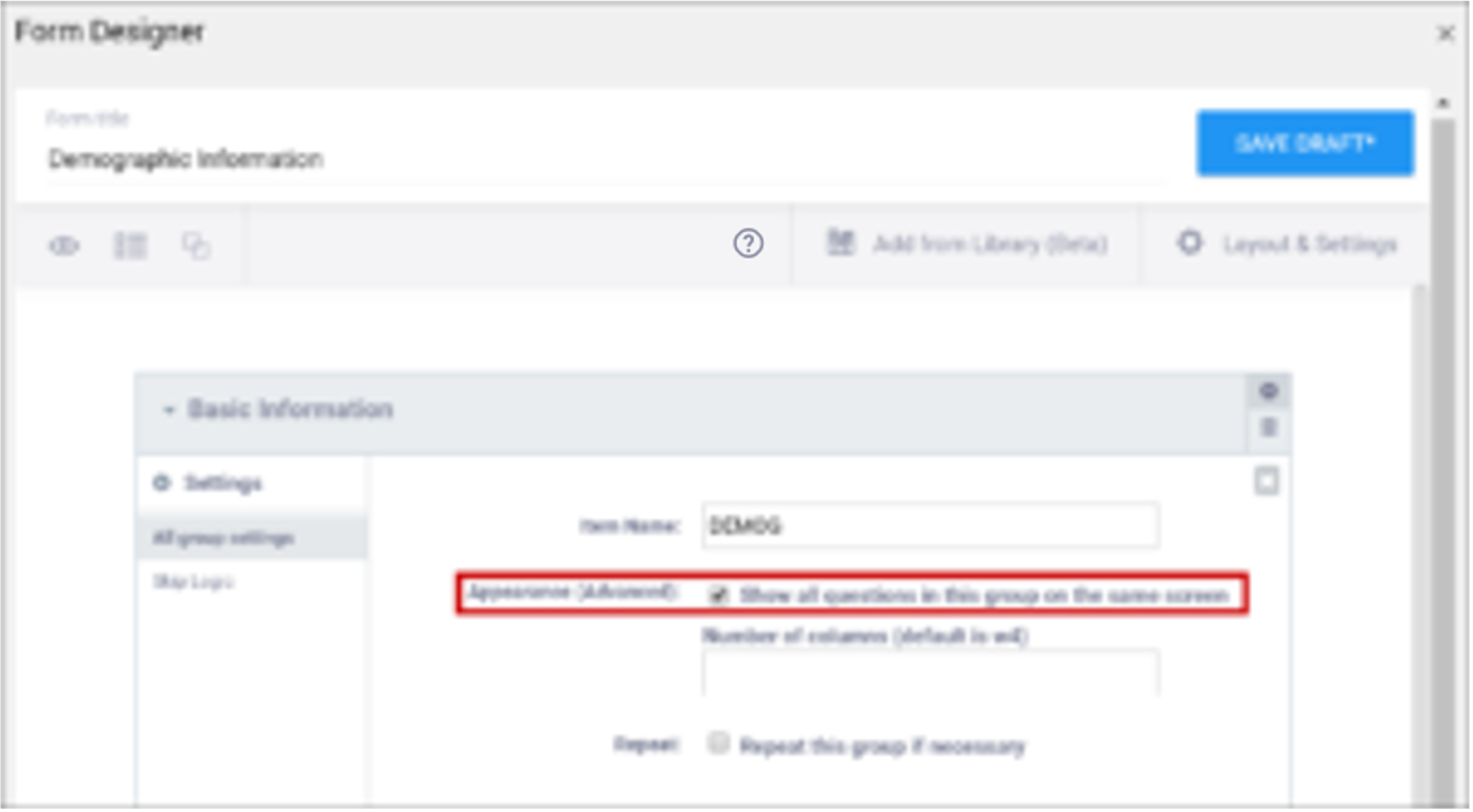 | N/A |
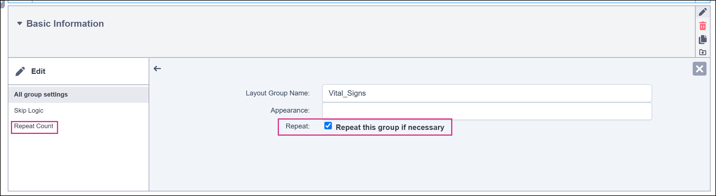
| Repeat this group if Necessary | This specifies that the group of items should be repeated. Click this check box to make the selected group of questions a repeating group. When this option is selected, the Repeat Count option becomes available in the left navigation menu, where you can optionally specify an expression to determine the number of repetitions automatically.
| This uses begin repeat and end repeat in the Type column to specify that the group of items should be repeated.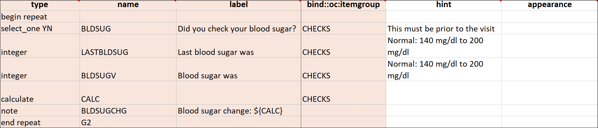 |
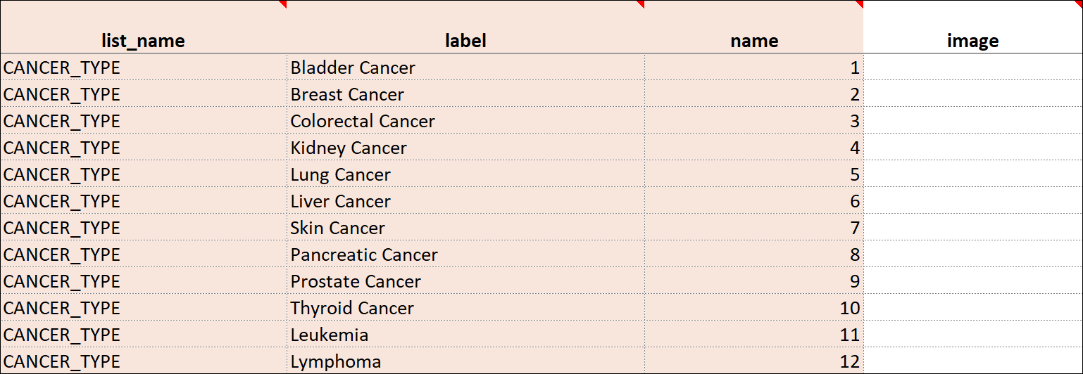
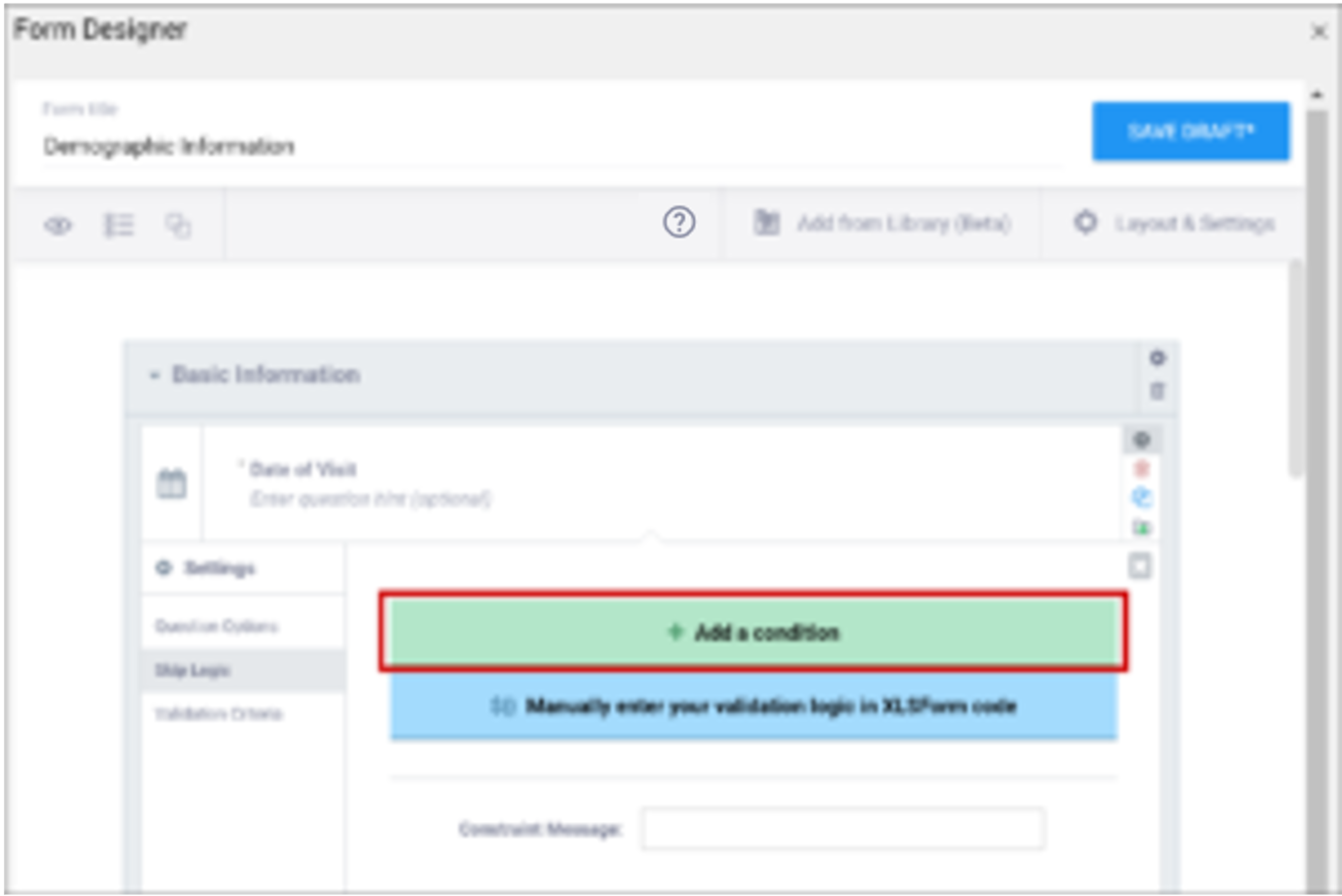
| Skip Logic / Relevant | This is a condition under which an item is skipped. Enter a condition under which this item/question appears or is required. | This is a condition under which an item is skipped (as defined in the relevant column). The item or group is only displayed if the provided expression evaluates to TRUE. Use the following syntax: ${other question name} = value (for a numeric value) or ${other question name} = 'value' (for a character value) If the lead-in question uses a code list defined in the choices worksheet, use what is in the name column for that code list as the value. For example, if you have two questions: Does the subject smoke? (item name = smoke) and How many packs per day? (item name=packs), the second question should only display if the answer to the first question is Yes. If the first question (smoke) uses a code list defined in the choices worksheet as: list_name label name The relevant syntax for How many packs per day would be: ${smoke} = 1 For multi_select items, use the following syntax: selected(${question name},value) (for a numeric value) selected(${question name},'value') (for a character string) ℹ️ Note: This column supports the syntax as defined in the required, calculations, or relevant columns. |
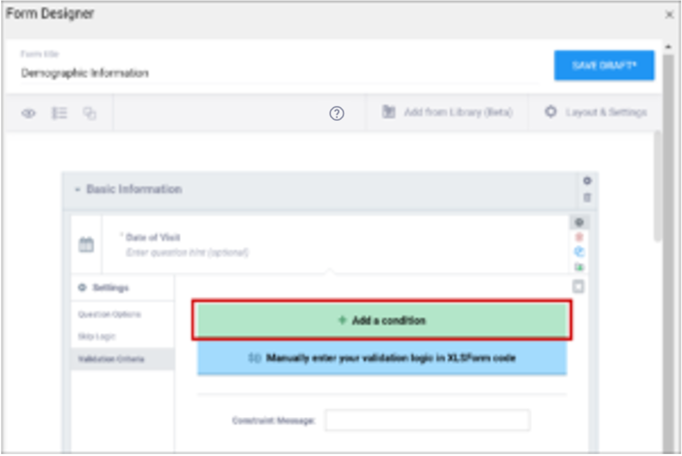
| Validation Criteria / Constraint | This is a condition under which an a response is considered invalid. Validation Criteria prevents users from entering invalid data. (e.g. "a Participant's pulse must be >=60 and <=100.")
| This is a condition under which an a response is considered invalid (as defined in the constraint column). Validation Criteria determines whether data is valid. This allows for edit checks, which you can define as soft checks or hard checks. If the expression provided in this cell is FALSE, the constraint_message displays. For example, if this item value must be between 10 and 60, enter the following (in expressions, . (dot) represents the current item value): . >= 10 and . <= 60 To reference other item values, use the following syntax: ${item_name} operator value Use and/or logic as needed. For example: ${sysbp} >=130 and . >= 10 and . <= 60 You can also compare date fields against today(). For example, to display a message if the date of an adverse event (AEDATE) is in the future, the constraint on the AEDATE field would be: .<=today() ℹ️ Note: This column supports the syntax as defined in the required, calculations, or relevant columns. |
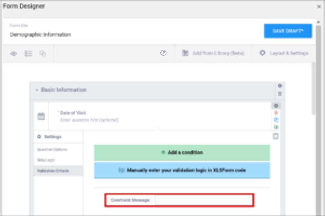
| Constraint Message | A message stating that data is invalid and/or explaining why it is invalid (e.g. "Pulse is outside normal range.") If you provide a constraint, you can include a message that explains why the answer provided is not acceptable. The message displays if the constraint expression is FALSE. For example, If you had the following constraint on the Pulse item: .>= 60 and .<=100 and a constraint_message of: Pulse is outside of the normal range. If someone entered a Pulse of 40, Pulse is outside of the normal range. would display on the form. | A message stating that data is invalid and/or explaining why it is invalid (e.g. "Pulse is outside normal range.") If you provide a constraint, you can include a message that explains why the answer provided is not acceptable. The message displays if the constraint expression is FALSE. For example, If you had the following constraint on the Pulse item: .>= 60 and .<=100 and a constraint_message of: Pulse is outside of the normal range. If someone entered a Pulse of 40, Pulse is outside of the normal range. would display on the form. |
| Contact Data | Displays contact data on Form. In the Use as External Value field, select contactdata. Save your draft and exit. Then re-enter Form Designer, and select the types of contact data you want to display. | bind::oc:contactdata Displays contact data on Form. |
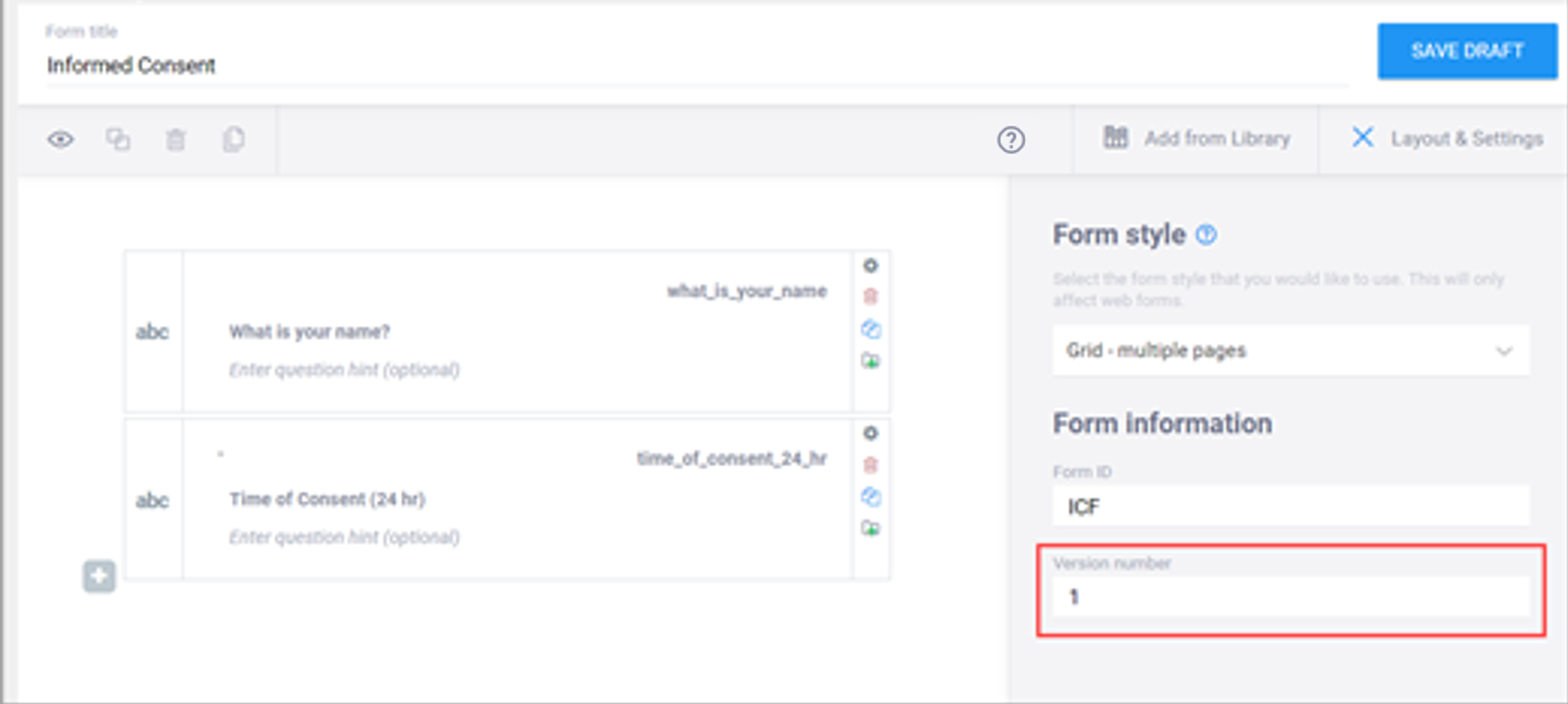
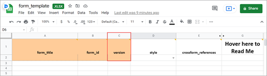















Form Title
The form title appears at the top of the data entry page.
BOTH Form Designer and Form Template - You can use alphanumeric characters, special characters (e.g. & # $ ^ _), and spaces.
Form ID
A unique identifier used as an internal reference when the form is uploaded. This value is not visible to end-users.
BOTH Form Designer and Form Template - Alphanumeric characters and underscores are permitted; no spaces.
Form Version
A unique identifier for an iteration of a given form (including changes to items, form logic, etc.).
Was this article helpful?
That’s Great!
Thank you for your feedback
Sorry! We couldn't be helpful
Thank you for your feedback
Feedback sent
We appreciate your effort and will try to fix the article